
 Google revamps their logo everyday with new themes, cartoon characters, sketches and colors. YAHOO! decided to make an artistic change as well — only, it doesn’t look that different than the old logo.
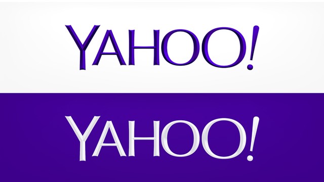
OK, it’s thinner and a little sleeker with a sans-serif font and purple text color; but perhaps the build-up increased our expectations?
Yahoo posted two flavors of the new look to its Tumblr at midnight on Thursday. One is white text on a purple background, the other purple text on white background. Both have a slight beveled effect, though it’s more noticeable on the purple text. It has already replaced the logo that appears on the top left corner of Yahoo.com.
“We knew we wanted a logo that reflected Yahoo – whimsical, yet sophisticated. Modern and fresh, with a nod to our history. Having a human touch, personal. Proud.,” wrote CEO Marissa Mayer in a blog post on Tumblr, which Yahoo bought earlier this year.
What do you think of the new logo?
")


